
Bigbank / Tallinn, Estonia
Duration
06.2019 - 09.2025
Team
Product Managers, Developers, Branch Managers, Analyst, QA Testers, Customer Service Representatives, Risk Manager, Marketing Specialists
Role
UX Designer
User research, User Flows, Rapid Prototyping, Workshop Facilitation, Interaction Design, Design System Creation
As part of Bigbank’s first centralized UX team, I helped modernize legacy systems, align design across international branches, and co-develop the bank’s first design system—used across internal tools and customer-facing products.
An interaction design prototype showcasing part of the user flow for the Hire Purchase application process
With a collaborative, research-driven approach, I focused on contributing meaningful insights from both field research and rapid prototype testing to support our design team’s shared goal of creating a new cross-branch banking platform.


What was the problem?
Legacy System Limitations - The Hire Purchase product required new data inputs and UI changes to align with rebranding and updated loan criteria. However, the outdated system and its technical debt made further development unfeasible, requiring a full rebuild from scratch.
Poor Clerk Experience Led to Lost Conversions - Shop clerks, our key partners in guiding customers toward a hire purchase provider, often found Bigbank’s legacy system slow and cumbersome. Competing providers with faster, more user-friendly systems were frequently favored, leading clerks to avoid recommending Bigbank’s solution altogether.
Friction for Customers - Since loan conditions were largely similar across competitors, the deciding factor for many customers became the speed and ease of the in-store application process. Bigbank’s old outdated system not only made the process slower but also limited our ability to adapt and update criteria, making loan approvals more difficult and less competitive.
Internal Team Struggles - The same outdated system was also used by Bigbank’s internal teams responsible for reviewing and approving loans. It was frustrating and inefficient to work with, and employees frequently expressed a strong need for a more modern, user-friendly alternative.
What did we solve?
With insights from my research and prototypes, I was able to
Map the Full Experience of Latvias HPR product for Back-Office Redesign
Researched, interviewed, and facilitated design workshops to create and validate detailed journey and experience maps for key personas—foundational inputs for designing the new back-office products across the bank.
Develop Cross-Audience Prototypes
Developed multiple prototypes tailored for partners, internal staff, and end users to validate key hypotheses through testing specific phases of the products flow.
Discovere that the suggested design could
Reduce application time for a hire purchase by
x 3
Boosted partner willingness to offer our product by
60%
Contribute to a Scalable Design System
Helped to lay the foundation for Bigbank’s company-wide design system, incorporating key insights from Latvian market research into both component design and usage guidelines for final products.
Cross-Branch Discovery: Understanding the Ecosystem
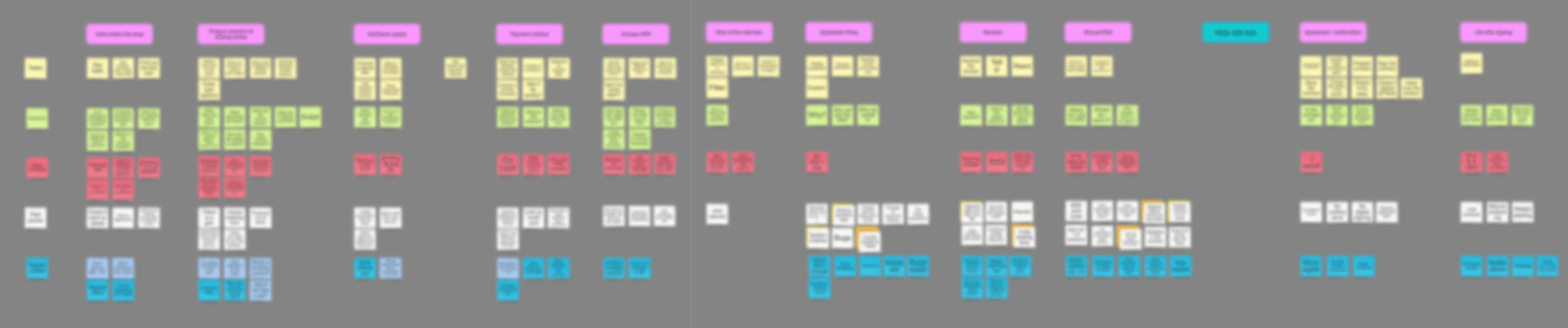
Over time, the systems used across Bigbank’s branches had diverged—largely due to acquisitions. To address this, our design team began by mapping general user journeys based on patterns identified through internal stakeholder interviews and comparisons of existing solutions. As a small team, each of us took ownership of a specific branch, allowing us to explore its unique workflows and tools in depth. With a unified research plan—including field visits, journey mapping workshops, prototype testing, and follow-up interviews—we were able to build a comprehensive knowledge base. This process confirmed some assumptions, challenged others, and uncovered entirely new insights, ultimately forming the foundation for a unified design direction.

Legacy system shown to illustrate its age and limitations (blurred for privacy)
I began by visiting our partners—retail shops that offered hire purchase loans directly to customers. By observing operations at over five different locations, I gained a clear understanding of their working environments, which were often fast-paced, noisy, and mentally demanding. Many shops operated with outdated computers and, in some cases, unreliable internet connections. It quickly became evident that competitors with faster, more technically optimized systems had a strong advantage. Clerks frequently preferred those alternatives due to their speed, responsiveness, and ease of use. Seeing firsthand how our system performed in the field—slow, non-responsive, and error-prone—revealed just how critical the issues were. To deepen my understanding, I also conducted rapid experience mapping sessions with clerks whenever possible, capturing their frustrations and needs—both when communicating with end customers and when coordinating with our internal bank teams handling loan approvals.
I also applied the same process to our internal bank staff, who used an even older back-office system to review applications and communicate with shop clerks. Through observations and quick experience mapping sessions, I uncovered key pain points in their workflows and communication processes.
Partner Experience Map (Blurred for Privacy)
Next, I had the opportunity to host a two-day workshop with key stakeholders from the branch, along with bank tellers responsible for overseeing partner-issued loans. We began by mapping the end customer experience from the very start—from their initial thoughts about taking a loan to their in-store interactions during the application process. Insights from the partner side helped everyone better understand the real challenges faced at the point of sale. We then continued by mapping the full end-to-end journey, covering how the bank and partners collaborate to issue the loan, all the way through to repayment.

End-to-End HPR Client Journey Map (Blurred for Privacy)
Results & Findings
Through in-depth research across branches, we synthesized our findings into clear, company-wide personas, user flows, and service blueprints. These artifacts captured both the user-facing journeys and the internal workflows behind them, helping us identify country-specific differences and align future product development efforts across teams.
Core Issues Identified in the Latvian HPR Experience

Outdated Partner-Facing System- Slow, unresponsive, and non-mobile-optimized system led shop clerks to prefer competitor tools.
Poor In-Store Experience for Customers - Lengthy and error-prone loan application flow caused frustration at the point of sale.
Inconsistent Communication Between Bank and Partners - Clerks lacked visibility into loan approvals, causing delays and confusion.
Laying the Foundation for Scalable Product Design
After collaboratively creating rough wireframes and user flows, key features were further prototyped and iteratively designed toward higher fidelity by each designer, then tested with users to ensure efficient use of resources. Simultaneously, we began building a shared design system, finalizing components as feedback from the iteration cycles was validated.
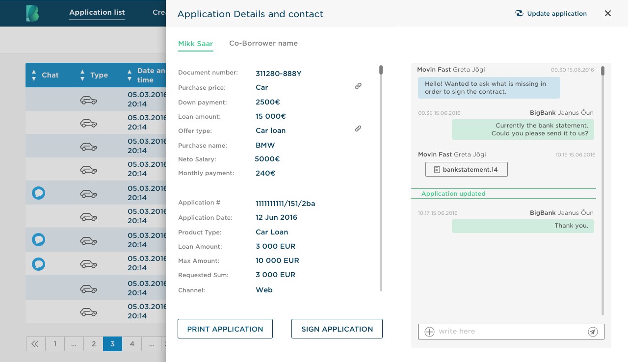
Partner dashboard prototype showcasing a strategically prioritized chat feature, enabling efficient document sharing and storage to facilitate loan approval.


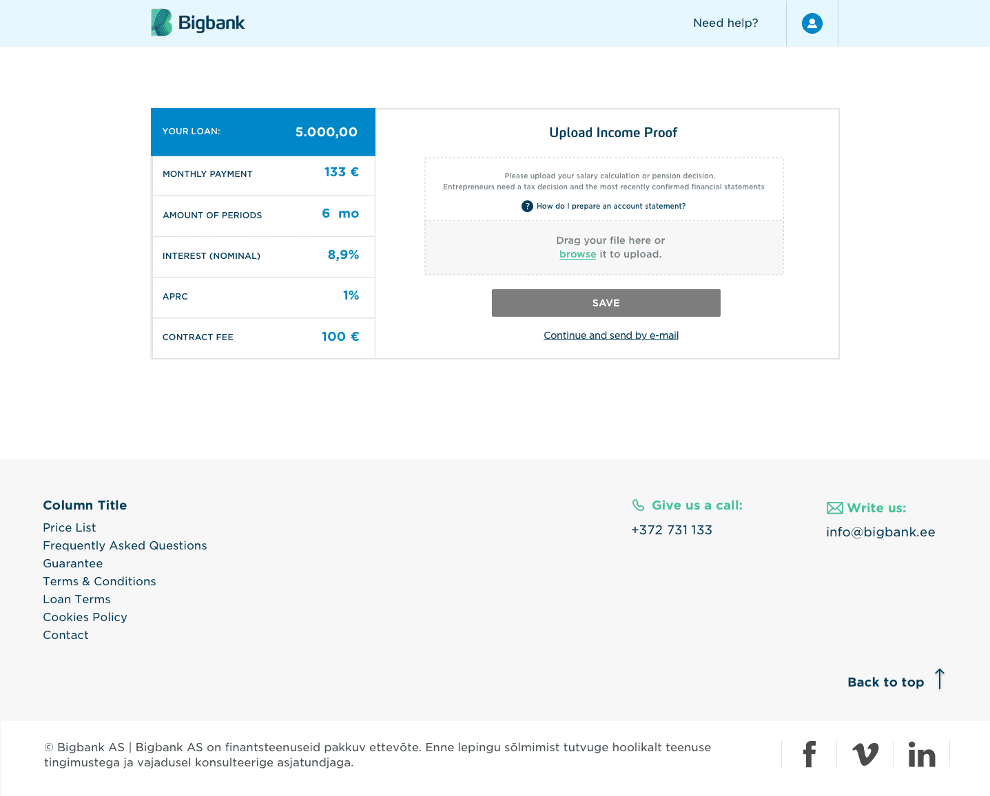
In the high-fidelity prototype, we reimagined the loan application flow with structured, easy-to-follow steps, intuitive input fields, and contextual support—ensuring users remain informed and confident at every stage.

Final Thoughts
A few months after I left the company, the back-office system was launched. It was later recognized at the 2017 Banking Technology Awards as a ‘Highly Commended’ project in the Best Tech Overhaul category. It’s been rewarding to see Bigbank continue to grow strongly ever since.
For me personally, this project was an excellent opportunity to experience first-hand how smoothly and collaboratively a large organization can operate, and how impactful a well-executed design system can be in driving consistency, efficiency, and long-term value across teams.